Platform UI Overview
The platform displays a very user-friendly and intiutive UI.

- The expand/collapse icon in the left allows to expand or collapse menu list view.
- The expand/collapse icon on the right allows you to expand or collapse the property panel view.
Customizations
The admin-level user can create new pages, customize, and define/configure pages as per the requirement.
The Main menu
The main menu or the burger menu appears on the top-left of the platform.
This is the entry point to the main modules within the platform.
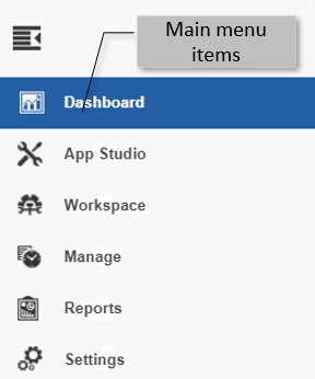
* Click the burger menu (three stacked lines) to view the main modules.
Title Bar
The title bar displays the settings and features applicable to all the pages on the Platform. The title bar has the main menu, page layout settings, help, and User details.

| Components | Description |
|---|---|
| Main menu | The Main Menu lists all the main pages of the Platform. |
| Bread crumb | The navigation path is displayed in the title bar next to the platform logo. |
| Settings | Platform page settings are displayed on the right side of the title bar. |
| Page Configuration | Active page configuration can be modified using the components in the page configuration. |
| Help | Help files can be accessed through the help icon. Click the help icon to view the files. |
| Notification | Platform notifications appear as a badge in the notification icon. Click to view the details. |
| Expand/collapse | Click the expand icon to expand the Platform and hide the title bar. A menu button appears. Click the Menu button to display the title bar. |
| User Details | Click the user icon. User details are listed under the following submenu items. |
Entity List and Entity Card
When you open a entity category, the center area displays the list of all entities in the selected module/submodule.
The entities are displayed in a card format with basic details of the entity in the card. The name displayed on the card is the entity name.

The entity card details:

Card name: Name of the application, flow, or the entity.
Card icon: The icon uploaded for the application.
Last modified: The date on which the entity was last modified.
Locked/Unlocked symbol: For an application, the card displays Locked or unlocked symbol. Locked symbol indicates that application is locked for the logged in user. Unlocked symbol indicates that the application is accessible for user to edit.
Refer to Locking and Unlocking Applications.
More Actions: Hover over the name card for viewing more actions (three dots).
Click the three dots and more actions applicable to that entity will be listed.
Only those actions that are enabled will apply to that entity.
Flow Module Design Canvas
When you open a flow module, the middle area displays the design canvas or the work area. The disign canvas within a flow include the design toolbar, design canvas, and activity panel. Properties panel appears on the right side of the design canvas.

Searching for an Entity
When you open an entitiy category, the entity list appears. Using the search feature, you can search for the entitiy name.
- Click the Burger menu and navigate to any module (say, App Studio > Applications). The entity list appears. Search box appears on the top-left.
- On the search box, type the name (or first few letters) of the entity name. The filtered results are displayed.

Sorting the Entities
When you open an entitiy category, the entity list appears. Using the sort feature, you can sort and list the entitiy names.
- Click the Burger menu and navigate to any module (say, App Studio > Applications). The entity list appears. Search box appears on the top-left.
-
Click the Ascending order sort icon (A→Z) for sorting in the ascending order (A→Z). The sort icon changes to descending order (Z→A).

-
Click the Descending order sort icon (Z→A). The entity cards get sorted in descending order (A→Z) of the names. The Sort icon is now changed to ascending order (A→Z).

-
Click the Ascending order sort icon (A→Z) for sorting in the ascending order (A→Z). The sort icon changes to descending order (Z→A).
Property Panel or Info Actions
The properties and configurations of a the selected item or entity are displayed in the property panel or the Info Actions. It can be the properties/configurations/mappings.
The selected item can be an entity card or item on the design canvas.
- Click a entity card. Properties of the corresponding entity are displayed in the Property panel.
-
Drag an activity to the design canvas and select (click) the activity. The property panel on the right side displays the details of the selected activity in different sections.
-
On the property panel, click the accordion in each section to view and configure different categories.
-
The actions applicable for the selected item are displayed at the bottom of the property panel.
")
-
Click the Expand Info Actions symbol (displayed at the top-right of the property panel). The Info Actions opens up in a pop-up. The different configuration sections are displayed in separate tabs.

Resource Data displays the list of available variables (Simple Variables and Entity Variables).
- Click the burger symbol in the Resource Data to hide/show the resource data list.
- To search for variables, type the variable name in the Variable search field.
- Drag a variable from Resource Data to the text box or any other variable holders as required.
- Click the Entity Variable to list all the variables within that.
- Click Close to close the expanded/pop-up view of the Info Actions.