Form2.0 – HTML Basic Components
Introduction to HTML Basic Components
Basic components are the most frequently used HTML form components. The Basic in component list contains all the primary components that are needed to create simple HTML forms.
- The generic aspects or common configuration elements/properties of the components are explained in the generic form document. This document covers only the component-specific configuration details.
Viewing and Understanding Basic Components
The components (or controls) required for designing the form are listed in the Component panel.
The different types of form components are listed in different categories. The most commonly used components used in the HTML form are listed under the Basic
- Navigate to the required application and process flow.
- Click an HTML Form (or create an HTML form). The Form designer opens. The component panel appears on the left side of the form designer.
- Click the expand/collapse arrow for expanding or collapsing the Components view.
-
Click Basic accordion for viewing the list of basic components.

Figure 1: Basic ComponentsA brief description of the basic components is tabulated in the following table.
Basic Components Description Autocomplete AutoComplete enables the user who designs the form to give a set of values from which the end-user can select one by typing a few characters during the runtime. Button Buttons are added to the form to perform various actions within the form. Checkbox The check box is used when you want the user to check/uncheck a text Date/Time The date/Time form component can be used to input dates, times, or both dates and times. Decimal Decimal is used to capture numerical or decimal values. HTML Element display a single HTML element Hyperlink The hyperlink component is used to provide a hyperlink to an URL iFrame iFrame acts as a tab for a browser. By providing an URL in the provided field, the link can be opened in the same form within the frame Image Image is used to display either a single image or a set of images in a carousel Label The label field is used for expressing the name or title text. Lookup The Lookup component is used to get the data from the data source. Number Number fields are used whenever a field should be limited to a number value. Password The password field accepts general text input and has the same options as a text field component except that the html \<input> is password instead of text. Hence, this field displays asterisks instead of the value entered. Radio The Radio button component allows the user to select only one value from a list of options. Range A Range component is used when the user needs to select a value between a particular range of values Select The Select displays a list of values in a dropdown list. Users can select one of the values. Select Boxes The Select Boxes allow the user to check multiple values from a list of options. Submit Button Submit Button is used to submit the form. Text Area A Text Area has the same options as the Text Field form component. The difference is that is a multi-line input field that allows for longer or multiline text. Text Field A Text Field is used for short and general text input.
Configuring Autocomplete
Autocomplete enables the user who designs the form to give a set of values from which the end-user can select one by typing a few characters during the runtime. Autocomplete box allows the end-user to type character(s) and the autocomplete feature lists the matching list of inputs as per the configuration.
Data type: The data type is based on the selected text entered by the end-user. String, numerals, symbols, and special characters are accepted in this field.
-
Drag an Autocomplete component to the Form designer or click the settings icon of an already existing Autocomplete component. The Autocomplete Component Configuration pop-up appears.

Figure 2: Auto Complete component configuration -
Provide the configuration details.
Autocomplete component-specific configurations are explained in the following table.
Properties Description Display tab Minimum Number Of Characters To Filter The minimum number of characters to be entered for filtering. When you enter the minimum number of characters, the auto filter will be active. You can use the spin arrows for incrementing/decrementing the values. Delay Time Fetches the filtered data within the specified time. Enter the delay time in milliseconds (1000 ms = 1s). Get Suggestions from custom source (Lookup) When the Get Suggestion From Custom Source (Lookup) is disabled, the Suggestion Type drop-down appears. Select the required option. Match any where: The entered text is matched anywhere in the list of labels available. Match only with starts value: The entered text is matched with the starting character(s) in the list of labels available. The labels are configured in the Data tab. Enabling Get Suggestion From Custom Source (Lookup) allows you to fetch matching data from another source (any DB source like Lookup). Data tab Data Source Values Values to use as the data source are defined here. Labels are shown in the select field. Values are the corresponding values saved with the submission. Enter Label, Value field is updated automatically. If you want a specific name for the value, you can type the value. Click Add Value to add Label/Value. Click the delete icon on the right side of each entry to remove the corresponding entry.
Configuring Button
The button is one of the most commonly used components. A button is added to the form to perform various actions within the form.
-
Drag a Button component to the Form designer or click the settings icon of an already existing Button component. The Button Component Configuration pop-up appears.

Figure 3: Button component configuration -
Provide the configuration details. Button component-specific configurations are explained in the following table.
Properties Description Display tab Action Select the action that needs to be performed by the button (on click during runtime). When you select an action, the Label takes that action's name. However, you can still change the label name after selecting Action. 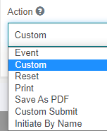 Custom: Select this to create your custom logic. Custom Button logic box appears where you can write your logic to evaluate when the button is clicked.
Refer to Writing Custom Button Logic. Event: Event action executes the event. Reset: Reset action resets the form. Print: The print action allows you to print the form. Save As PDF: Save As PDF is used to save the form in PDF format. Custom Submit: Select Custom Submit and Advance Lookup is enabled. Click Advance Lookup and you can define a method for the Lookup. Custom Submit will trigger the lookup that is configured.
Refer to Configuring Custom Submit – Advanced Lookup. Initiate By Name: Select Initiate By Name and Initiate By Name is enabled. Click Initiate By Name and you can define Process by configuring the process name. Custom Submit will trigger the process that is configured.
Refer to Configuring Initiate By Name.Button Custom Logic If you select Custom as the Action, Button custom logic appears. Enter the custom logic to evaluate when the button is clicked. As Custom is selected by default in the Actions, Button custom logic appears by default.
Refer to Writing Custom Button Logic.Size Allows you to select a size for the button. 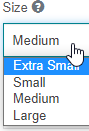
Left Icon This is a full icon class string to show the icon. If you need an icon on the button indicating the function of the button, you can specify the icon name. The icon appears on the left side of the button label. The icons supported are glyphicons and font awesome icons. E.g., 'glyphicon glyphicon-search' or fa fa-plus'. Right Icon This is a full icon class string to show the icon. If you need an icon on the button indicating the function of the button, you can specify the icon name. The icon appears on the right side of the button label. The icons supported are glyphicons and font awesome icons. E.g., 'glyphicon glyphicon-search' or fa fa-plus'. Title Enter the title for the button and this appears when you hover over the button. Block This spans the full width of the bounding container. That is, if you enable Block, the button length spans to the complete width of the control. Disable on Form Invalid Enabling this will disable the button if the form is invalid.
Writing Button Custom Logic
-
In the Button component configuration, click the Display tab.
-
From the Actions drop-down list select Custom, Button Custom Logic appears.

Figure 4: Writing Button custom logic -
Enter the logic for your button in javascript. The logic is executed when you click button during the runtime.
Configuring Custom Submit – Advanced Lookup
The advanced lookup allows you to configure a lookup for the Custom Submit button.
-
In the Button component configuration, click the Display tab.
-
From the Actions drop-down list select Custom Submit, and Advanced Lookup appears.

-
Click the icon next to Advanced Lookup. Advanced Look-up pop-up appears.
Refer to Configuring Advanced Lookup for further configurations in Advanced Lookup.
Configuring Initiate By Name
The Initiate By Name feature allows you to initiate a process through the click of the Initiate By Name button.
-
In the Button component configuration, click the Display tab.
-
From the Actions drop-down list, select Initiate By Name. Initiate By Name pop-up appears.

-
Click the icon next to Initiate By Name. Initiate By Name up pop-up appears.

Figure 5: Initiate Process By Name -
Provide the details as explained in the following table.
Properties Description Variable Name Enter the property name of the component to which you need to parse the data. Data Type Data type of the variable. Value Enter a value or property name of the component from which you need to parse the data. Add Value Click Add Value to add more variable fields and corresponding details. Is Async Select the check box to make the flow asynchronous. Workflow Name Enter the flow name that is to be triggered. Application Name Enter the application name to which the flow belongs. On Complete Callback Enter the method name to be executed. Method name is to be specified in the JS. Transition to take The transition name (link name in the process flow) to be followed for execution. Complete Initiator Task This is a flag to complete the initiator task in the selected process. Selecting the checkbox sets the flag to “True” and deselecting the checkbox indicates the flag is set to “False. -
Click Confirm after providing the details.
Configuring Checkbox
The check box is used when you want the user to check/uncheck a text. A check box is used for the boolean value input field. It can either be on or off. Check and Uncheck are the two values available for the check box.
-
Drag a Checkbox component to the Form Designer or click the settings icon of an already existing Checkbox component. The Checkbox Component Configuration pop-up appears.

Figure 6: Checkbox component configuration -
Provide the configuration details.
Checkbox component-specific configurations are explained in the following table. | Properties | Description | |---------------------------------|-----------| | Input Type | There are two input types for the check box. | | |

- Checkbox: Select checkbox if you want a normal checkbox view with a tick mark (if selected) and a blank box (if not selected)
- Switch: Select switch if you want a switch type selection/deselection. | | Display Checkbox in header | When you enable this, Select Parent Type appears.
Select Sub Form or Summary Form as per your requirement.
In subform and summary form the checkbox appears on the header. |
Configuring Date/Time
The date/Time component is used when you want the end-user to provide a Date and Time as the input.
The date/Time component accepts date and time. The user will be prompted with the Date/Time widget in which date and time can be selected.
Data Type: Date, Time
-
Drag a Date/Time component to the Form designer or click the settings icon of an already existing Date/Time component. The Date/Time Component Configuration pop-up appears.

Figure 7: Date-Time component configuration -
Provide the configuration details.
Date/Time component-specific configurations are explained in the following table.
Properties Description Display tab Configure Date - Select an option from the list.

- Date: The UI accepts only the date as input. When you select Date, Default Date and Date Format appear on the Display tab.
Refer to Configuring Date and provide for the remaining date configuration in the Display tab and Configuration tab.
- Time: The UI accepts only the time as input. When you select Time, Default Time and Time Format appear on the Display tab.
Refer to Configuring Time and provide for the remaining date configuration in the Display tab and Configuration tab.
- Date/Time: The UI accepts date and time as input. When you select Date/Time, Default Date/Time and Date/Time Format appears on the Display tab.
Refer to Configuring Date/Time for providing the remaining date configuration in the Display tab and Configuration tab.Use Configured Formats During Update Enabling this will retain the format whenever the value is updated 3. Click the Configuration tab. The configuration details are based on what you have selected: Date, Time, or Date/Time.
Refer to the followingsubsections for configuration details.
Configuring Date
-
In the Display tab, select Configure Date = Date and provide details as explained in the following table.
Date Configuration Description Default Date - When you select Configure Date = Date, the Default Date field appears.
- Specified Date: Select a specific date and the Date field appears for selecting the specified date.
- Click the Date box and enter the date in the format selected under Date Format or click the date picker icon in the date field for selecting the required date from the date picker.
- Today: Click Today to select the current date.
- Clear: Click Clear to clear the current selection of date or time or both.
- Close: Click Close to close the date picker.
- Current Date: The current date, that is, the date on which the user acts on the form appears in the field as default input.Date Format - Select a specific date format from the list of available formats. -
Click Configuration tab, and the Date related configuration details appear.

Figure 8: The Configuration tab details for the Date componentProperties Description Custom Minimum Date - Enable this to provide the minimum date. You can provide custom minimum date using momen.js functions.
E.g., moment().subtract(5, 'days').
If Custom Minimum Date is disabled, there will not be any minimum date.Minimum Date Provide the minimum date that can be picked. Custom Maximum Date - Enable this to provide the maximum date. You can provide custom maximum date using momen.js functions.
E.g., moment().add(10, 'days').
If Custom Maximum Date is disabled, there will not be any maximum date.Maximum Date Provide the maximum date that can be picked. Starting Day - Select the day that is to be the first day of the week. Day is displayed in the drop-down. Minimum Mode - Select the smallest unit of time view to display in the date picker. Maximum Mode - Select the largest unit of time view to display in the date picker. Number of Years displayed (Rows) The number of years to be displayed in the year-view (in Rows). Number of Years displayed (Columns) The number of years to be displayed in the year-view (in Columns). Show Week Numbers Enable this to show the week numbers in the date picker.
Configuring Time
-
In the Display tab, select Configure Date = Time and provide details as in the following table. | Properties | Description | |-------------------------------|-------------------------------------------| | Custom Minimum Date | - Enable this to provide the minimum date. You can provide custom minimum date using momen.js functions.
E.g., moment().subtract(5, 'days').
If Custom Minimum Date is disabled, there will not be any minimum date. | | Minimum Date | Provide the minimum date that can be picked. | | Custom Maximum Date | - Enable this to provide the maximum date. You can provide custom maximum date using momen.js functions.
E.g., moment().add(10, 'days').
If Custom Maximum Date is disabled, there will not be any maximum date. | | Maximum Date | Provide the maximum date that can be picked. | | Starting Day | - Select the day that is to be the first day of the week. Day is displayed in the drop-down. | | Minimum Mode | - Select the smallest unit of time view to display in the date picker. | | Maximum Mode | - Select the largest unit of time view to display in the date picker. | | Number of Years displayed (Rows) | The number of years to be displayed in the year-view (in Rows). | | Number of Years displayed (Columns) | The number of years to be displayed in the year-view (in Columns). | | Show Week Numbers | Enable this to show the week numbers in the date picker. | -
Click Configuration tab and the Time-related configuration details appear.

Figure 9: The Configuration tab details for the Time componentProperties Description Enable Time Input Select the check box for enabling time input for this field. Hour Step Size The number of hours to increment/decrement in the time picker. Minute Step Size The number of minutes to increment/decrement in the time picker. 12 Hour Time (AM/PM) Enabling this will display time in 12-hour format with AM and PM Read-Only Input Enabling this will make the time picker input boxes read-only. The time can only be changed by increment or decrement buttons.
Configuring Date/Time
-
In the Display tab, select Configure Date = Date/Time and provide details as in the following table.
Date/Time Configuration Description Default Date/Time - When you select Configure Date = Date/Time the label changes to Configure Date/Time and the Default Date/Time field appears.
Select Specified Date Time or Current Date Time from the drop-down as per your requirement.

Specific Date/Time: Select specific date/time and the Date/Time field appears for selecting the specified date/time.

Click DateTime box and enter the date/time in the format selected under Date/Time format or click the date/time picker icon in the date/time field for selecting the required date/time from the date/time picker.

Today: Click on today selects the current date.
Clear: Clears the current selection of date or time or both.
Time: Displays Time picker.
Date: On click displays date picker.
Date and Time options toggles on click of the Date / Time button.Close: Click Close to the date/time picker.
Current Date/Time: The current date/time, that is, the date/time on which the user acts on the form appears in the field as default input.
Date/Time Format Select a specific Date/ Time format from the list of available formats.

-
Click Configuration tab, the Date and Time related configuration details appear. Follow the configuration details in the above two sections for date and time configurations.
Configuring Decimal
The decimal component is used whenever an input field is limited to a numeric or decimal value. The decimal components accept input values as integers or decimal numbers.
Data type: Decimal (Numerals, Decimals). The values entered by the user are stored as decimal values.
-
Drag a Decimal component to the Form designer or click the settings icon of an already existing Decimal component. The Decimal Component Configuration pop-up appears.

Figure 10: Decimal component configuration -
Provide the configuration details.
Decimal component-specific configurations are explained in the following table.
Properties Description Display tab Increment (Step) - Increment indicates the interval by which the numerical value needs to increment/decrement for each step.
During runtime, spin arrows appear by which you can increment/decrement the values. If a value is there in the box, the increment/decrement happens over/below that value by the increment/decrement value entered.
Configuring HTML Element
HTML Element is added to a form to display a single HTML element. This is useful if you wish to quickly insert and configure some HTML in your form.
-
Drag a Decimal component to the Form designer or click the settings icon of an already existing Decimal component. The Decimal Component Configuration pop-up appears.

Figure 11: HTML component configuration -
Provide the configuration details.
Decimal component-specific configurations are explained in the following table.
Properties Description Display tab Container Custom Class - This is the same as the custom CSS class for other components.
- Enter the custom CSS class to add to this component.HTML Tag - Enter a tag of the HTML element. The content entered in the box will be tagged with the entered HTML tag. CSS Class - Enter the CSS class for this HTML element. Attributes - Enter the attributes for this HTML element. Only safe attributes are allowed such as src, href, and title.

- Enter Attribute name and Value.
- Click Add Value, for adding a new Attribute-Value.
- Click remove icon adjacent to the row for removing that particular entry.Content - Enter the content for this HTML element.
Configuring Hyperlink
The hyperlink component is used to provide a hyperlink to an URL.
-
Drag a Hyperlink component to the Form designer or click the settings icon of an already existing Hyperlink component. The Hyperlink Component Configuration pop-up appears.

Figure 12: Hyperlink component configuration -
Provide the configuration details.
Hyperlink component-specific configurations are explained in the following table. | Properties | Description | |---------------|-----------------------------------| | Display tab | | | Label | Provide the Label for the component. | | Link Label | Enter the content that is to be linked. The hyperlink to this content is provided in Data tab > Default Value field. | | Target Window | - Sets the target window or frame to display the web page content linked to when the Hyperlink component is clicked.
-
- Current Window: The linked page opens in the current window.
- New Window: The linked page opens in a new window. | | Data tab | | | Default Value | Enter the hyperlink. On click of the Link Label user is navigated to this link. |
Configuring iFrame
iFrame acts as a tab for a browser. By providing an URL in the provided field, the link can be opened in the same form within the frame.
-
Drag an iFrame component to the Form designer or click the settings icon of an already existing iFrame component. The iFrame Component Configuration pop-up appears.

Figure 13: iFrame component configuration -
Provide the configuration details.
iFrame component-specific configurations are explained in the following table.
| Properties | Description |
|------------|-------------|
| *Display tab* | |
| Width | Width of the iframe. iFrame width should be entered in px or %. E.g., 100px or 50%. |
| Height | Height of the iframe. iFrame height should be entered in px or %. E.g., 100px or 50%. |
| URL | Enter the source URL for the iFrame. URL is a mandatory configuration for iFrame. |
Configuring Image
Image is used to display either a single image or a set of images in a carousel. The carousel is a slideshow for cycling through a series of content. It works with a series of images.
-
Drag an Image component to the Form designer or click the settings icon of an already existing Image component. The Image Component Configuration pop-up appears.
Figure 14: Image component configuration -
Provide the configuration details.
Image component-specific configurations are explained in the following table.
Properties Description Display tab Image Alias Enter the text that has to be displayed if the image cannot be displayed. Add Image Dynamically Enabling this renders the image component with a button to dynamically load the image via event. Data Upload Default Image Enable this to upload a default image. An option to choose the default image appears. 
Carousel This is displayed when the Upload Default Image is disabled. Carousel allows you to upload multiple images to an image component. Multiple images are displayed in a slide show model. Check the Carousel checkbox and the Image URL details appear. Image URL The image URL section allows you to specify multiple URLs for your carousel.  If you have multiple images that are stored in the local system, then you have to upload the images to the server and you need to provide the path of files in the server.
Interval Specify the delay time between each image during the slide show in the runtime. Delay time should be entered in milliseconds. -
Click the Layout tab. The layout tab displays the Carousel/Image properties along with default component details.
-
If Carousel is checked in the Data tab, Carousel details appear and hence provide the carousel details as explained in the following table.

Figure 15: Carousel properties in the Layout tabCarousel properties Description Height Height of the carousel in px or %. Width Width of the carousel in px or %. Indicator color Select a color for the carousel indicators. The indicators are the little dots at the bottom of each slide (which indicate how many slides there are in the carousel and which slide the user is currently viewing). Carousel Navigator color Select the color for the navigator. Navigator arrows (backward “<” and forward “>”) appear before and after the indicator dots. Else if Carousel is unchecked in the Data tab, Image details appear and then provide the image details.

Figure 16: Image properties in the Layout tabProperty Description Upload Default Image Enable upload default image. Choose file option appears. Choose the image file. Height Height of the carousel in px or %. Width Width of the carousel in px or %. Border Radius Enter the border radius of the image in px. The border is curved based on the value entered. Opacity Enter the opacity for the image in percentage. Border Enter the border thickness (in px) and color.
Configuring Label
The label is a basic control used to show a label or content in the UI.
Data type: String (Alphabets, numerals, and symbols). The values entered by the user is stored as a string value.
-
Drag a Label component to the Form designer or click the settings icon of an already existing Label component. The Label Component Configuration pop-up appears.

Figure 17: Label component configuration -
Provide the configuration details.
Label component-specific configurations are explained in the following table.
Properties Description Layout tab Font Size Enter the font size. Font size is in points. Font Family Select the required font type from the Font Family. Bold Enable Bold to make the text bold. Italic Enable Italic to make the text italic. Underline Enable Underline to make the text underlined.
Configuring Lookup
Lookup component is used to fetch the data from a data source such as a database or URL and fill it to other components on the form. The lookup component reads the data from the specified data source (database or any other source) based on the criteria/query provided.
-
Navigate to the required application and process flow.
-
Click an HTML Form. The Form designer opens. The component panel appears on the left side of the form designer.
-
Click the expand/collapse arrow for expanding or collapsing the component view.
-
Click Basic accordion for viewing the basic components.
-
Drag a Lookup component to the Form designer or click the settings icon of an already existing Lookup component. The Lookup Component Configuration pop-up appears.
Figure 18: Lookup component configuration -
Click the Display tab and provide details.
Property Description Property Name The property name of the lookup component is auto-updated. GUID The name of this component field in GUID. Label Name or title for the component that appears on the UI. Description Description of the component. The description appears below the input field. Tooltip Enter the tooltip for the component. This adds a tooltip icon beside the component. Custom CSS Class Enter a custom CSS class to add to this component. You can add multiple class names separated by a space. The CSS is written in the CSS editor (Form Toolbar > Click CSS icon) Hidden Enabling the switch allows to hide the component from view. A hidden field is still a part of the form, but it is hidden from view. Is Cache Enabled Enable the switch to make the cache enabled so that data is cached. Load By Name This is used to preview the form. Enabling this loads the Form in a separate window and details are rendered without fail. You can call the lookup of an application in another application. Avoid Lookup in view mode Enable this to avoid the lookup trigger in the summary form view mode. -
Click Lookup tab and select the Data source type from the drop-down.

Figure 19: Selecting Data source for the lookup-
Data Base: Select Data Base if you need to look up a database.
-
URL: Select this option if you need to look up a URL.
-
-
If you select Data Base as the source type, refer to Configuring Database in Lookup. Or If you select URL as the source, refer to Configuring Advanced Lookup.
-
Click Save on the Lookup Component pop-up to save the configured details.
-
Click Save on the Form Designer page to save the form configurations.
Configuring Database in Lookup
For configuring a database in lookup, you need to create a business entity – database scripts that are to be mapped in the lookup control. The entity, database script should have the configuration, SQL Type = Database Lookup. The database scripts with SQL Type = Database Lookup are only listed in the Lookup configuration for mapping. You can write the required query for extracting the records from the datasource in the database script entity with SQL type, Database lookup.
- In the Lookup configuration, click Lookup tab.
-
Select Data Source Type = Data Base. Data base-related properties appear.

Figure 20: Lookup data base configuration -
Provide the details as explained.
Field Description Database Scripts Click and select the database script created for the lookup. This is mandatory when you select data source type. The drop-down displays all the database scripts that are of the type Database Lookup. Refresh Settings Click the Refresh icon for refreshing the database script. If you have made any changes in the selected database script after configuring it to the lookup component, you can click refresh and the changes are reflected. Already configured items will be as such and a view of modified columns are displayed. Column Structure Column Structure is displayed based on the “select” criteria defined in the database script. Column Name displays the column name and the Data Type displays the data type of the column. If you update the database script, click Refresh icon to get an updated view. Click the value column and drag the corresponding variables (property name of the component) from the Resource Data (Click the arrow on the top-right side for viewing the variables) Condition If there is a “where” clause defined in the database script, that condition variable appears below the Column Name. Below the values, provide the property name of the component to which the variable needs to be mapped. Look Up Fire Event Click and select the event as needed from the drop-down (say select Form Load). On Relative change: The lookup details appear on the Form dynamically based on the relative change of a particular field. If you select this option, “On Relative Change” textbox appears below. The property name of the field for which the relative change has to happen is mapped to “On Relative Change” text box. Form Load: The event is triggered when the form is loaded. On Relative Change This field shows up if you have selected Lookup fire event as “On Relative Change”. Provide the property name of the component for which the relative change has to trigger. Binding Control Enter the property name of the component to which the relative change result data is binding. Components to Persist Data Types Enter or drag a property name. This content gets ignored if Bind to control is available. If Bind to control is not available the data is stored in the property name provided. The data type is persisted as such. Executes Lookups Asynchronously Enabling this executes multiple lookups asynchronously. Execute Lookup before Form render This field shows up if you have selected Lookup fire event as “Form Load”. Enable this to execute the lookup before Form is rendered. -
Click Save on the Lookup Component pop-up to save the configured details.
-
Click Save on the Form Designer page to save the form configurations
Configuring Advanced Lookup
Advanced Lookup is used to call the API directly.
-
In the Lookup configuration, click Lookup tab.
-
Select Data Source Type = URL. Advanced Lookup option appears.

Figure 21: URL selection and Advanced Lookup -
Click the icon on the right side of Advance Lookup.

Figure 22: Advanced Lookup pop-up -
Select the Method from the drop-down. The selected service is called during the runtime.

-
Enter a Request URL.
-
Click Params and provide details. Params (Parameters) is selected by default.

Figure 23: Params details -
Enter the Key and Value in the appropriate boxes.
-
Click Add Value for adding another Key-Value pair.
-
Click the remove icon on the right side to remove a key-value pair.
-
Click Headers and provide details.

Figure 24: Headers details -
Enter the Key and Value in the appropriate boxes.
-
Click Add Value for adding another Key-Value pair.
-
Click the remove icon on the right side to remove a key-value pair.
-
Click Body.
-
Click Key Value option.

Figure 25: Body – Key Value -details -
Enter the Key and Value in the appropriate boxes.
-
Click Add Value for adding another Key-Value pair.
-
Click the remove icon on the right side to remove a key-value pair.
-
Click Raw option

Figure 26: Body Raw details -
Enter the raw data in JSON/XML/Text format for the body.
-
Click Response.

Figure 27: Response details -
Provide the Response details as explained in the following table.
Property Description Column Name Enter the database column name (header). Column Data Enter the property name of the form component where you need to render the output data. Add Value Click Add Value to add Column Name and Column Data. Response Success Key Enter the success key in the response. Usually, the success key is ‘success’. Response Success Status Enter the Response success status. Usually, the success status is ‘true’. Response success status will be Boolean (true or false) Key To Read The Data From Enter the key from where the data is to be read from the response data. Usually, the key is ‘data’. Nested Key to Read the Data From Enter the key within the data from where the data is to be read. Key to Read the Error From Enter the key from where the error is to be read. Usually, the error key is ‘error’. Default Error Parsing - Check: Default error is handled by the product itself. The error message is displayed in a pop-up window. - Uncheck: The error is thrown in the network tab. Bind to Component Key Enter the property name (you can drag from the variable list) of the component to which you need to bind the result data. Persist Component Data Type - Enter or drag a property name. This content gets ignored if Bind to control is available. - If Bind to control is not available the data is stored in the property name provided. The data type is persisted as such. Show Success Window Enable the switch to show a success pop-up window if the execution is a success. 23. Click Confirm after providing the Advanced Lookup configurations. -
Click Save on the Lookup Component pop-up to save the configured details.
-
Click Save on the Form Designer page to save the form configurations.
Configuring Number
The number component is used whenever an input field is limited to a numerical value. The number components accept input values as integers and decimal numbers.
Data type: Numerals, Decimals. The values entered by the user are stored as decimal values.
It is to be noted that when you specify input a value to the Number component, internally the value is stored as a decimal.
-
Drag a Number component to the Form designer or click the settings icon of an already existing Number component. The Number Component Configuration pop-up appears.

Figure 28: Number component configuration -
Provide the configuration details.
The number component-specific configurations are explained in the following table.
Property Description Display tab Increment (Step) Increment indicates the interval by which the numerical value needs to increment/decrement for each step. During runtime, spin arrows appear by which you can increment/decrement the values. If a value is there in the box, the increment/decrement happens over/below that value by the increment/decrement value entered.
Configuring Password
The password component is used when you need to enter a password. It accepts the entered data and hides the text to protect the data. The entered text is displayed as asterisks for the user in the UI.
Data type: String, numerals, symbols, and special characters are accepted in this field.
-
Drag a Password component to the Form designer or click the settings icon of an already existing Password component. The Password Component Configuration pop-up appears.

Figure 29: Password component configuration -
Provide the configuration details.
Configuring Radio
The radio button is used when you want the user to select an item from the group of items displayed. Users can select only one item from one radio button group. The radio button is also referred to as the option button.
Data type: String (alphabets, numerals, and symbols).
-
Drag a Radio component to the Form designer or click the settings icon of an already existing Radio component. The Radio Component Configuration pop-up appears.

Figure 30: Radio component configuration -
Provide the configuration details.
Radio-specific configurations are explained in the following table.
Property Description Display tab Inline Layout Enable Inline Layout for displaying the radio buttons horizontally in a line. Data tab Values Values are the texts that appear next to the Radio buttons in the form. 
- Add Label for the radio. Value appears on the value box. You can change the value if you want to.
- Click Add Value to add more labels for the radio.
- Click the remove icon on the right side to remove a label.Default Value If you enter one of the radio button values in the Default Value, that option will become true (that is, that option gets selected) in the UI during the runtime.
Configuring Range
A Range component is used when the user needs to select a value between a particular range of values.
-
Drag a Range component to the Form designer or click the settings icon of an already existing Range component. The Range Component Configuration pop-up appears.

Figure 31: Range component configuration (validation tab) -
Provide the configuration details.
Range-specific configurations are explained in the following table.
Properties Description Validation tab Interval Enter the step size of each increment. Lover bound Value Enter the lower bound value for the range. Specified lower bound is included in the lower range. Upper bound Value Enter the upper bound value for the range. The specified upper bound is included in the upper range. The following UI appears for the user for the range component in the form.

Users can scroll the small circle in the range bar to specify the value from the range of values displayed.
Configuring Select
A Select component allows the user to select an item from the drop-down list.
Data type: String (alphabets, numerals, and symbols).
-
Drag a Select component to the Form Designer or click the settings icon of an already existing Select component. The Select Component Configuration pop-up appears.

Figure 32: Select component configuration -
Provide the configuration details.
Select specific configurations are explained in the following table.
Property Description Display tab Infinite Scroll When true, it loads all the details with a scroll. This property is specific to the Select component. Data tab Data Source Type Select the data source type from the drop-down. 
- Values: Enter the Labels / Values that are to be displayed in the select drop-down.
Refer to Configuring Select Items.
- Raw JSON: You can provide raw JSON data.Item Template Enter the HTML template for the result data items. Add Please Select Enable this so that you can add a “Please Select” that appears in the display list. Select Text Select Text for Lookup. This appears as the first item on the list.
Configuring Select Items
-
In the Select Configuration > Validation Tab > select Data Source Type = Values. The corresponding properties appear.

Figure 33: Entering Values for the Select -
Enter Label. The Labels entered are displayed in the select drop-down.
-
Enter the Value. Values are auto-updated when you enter the label. Values are the corresponding values saved with the submission.
-
Click Add Value to add multiple labels
-
Click the remove icon on the right side of each Label-value for removing the corresponding entry.
-
Click and enable Allow to Add option for manually adding a value in the select box.
Configuring Raw JSON
-
In the Select Configuration > Validation Tab > Select Data Source Type = Raw JSON. The corresponding properties appear.

Figure 34: Defining Values using Raw JSON -
Below the Data Source Raw JSON, enter a Raw JSON array to use as a data source. The content should be an array of objects with Label-Value (Key-Value) pairs.
-
Below Value Property, enter the property for the selected item. This is the property of each item in the data source to use as the select value. If the Value property is not specified, the item itself will be used.
-
Below Limit, enter the maximum number of items to view in the drop-down during runtime.
-
In the Search Filter drop-down, select the required filter.
-
Contains: Select this if you want to filter the searched text in the search items.
-
Starts With: Select this if you want to filter the searched text at the start of the search items.
-
Configuring Select Boxes
A Select Box component is used when the user needs to select multiple items from the list of items.
-
Drag a Select Box component to the Form designer or click the settings icon of an already existing Select Box component. The Select Box Component Configuration pop-up appears.

Figure 35: Select Box component configuration -
Provide the configuration details.
Select Box-specific configurations are explained in the following table.
Property Description Display tab Inline Layout Enable Inline Layout for displaying the select items horizontally in a line. Enable Scrollbar Enable the scrollbar when there are more than the specified number of items. A text box appears. 
In the textbox enter the maximum number of options to display before the scrollbar appears.Data tab Select Boxes This section allows you to define the list of items.
The labels are displayed in the select box in the form. The Values are the corresponding values saved
with the submission.

- Click Add Label. The value appears on the value box. You can change the value if you want to.
- Click Add Value to add more labels.
- Click the remove icon on the right side for removing a label-value pair.
Configuring Submit Button
A submit button is used to submit the form. Usually, there will be a system submit button in every form that you create which is hidden during the design time and visible during the runtime for the user to submit the form.
To add a submit button (from the form component list), then you need to disable the system submit button.
-
Drag a Submit Button component to the Form Designer. If you have not disabled the system submit button, an instruction pop-up appears.

-
Click OK.
-
Navigate to Form Toolbar > Form Settings > Action tab.

-
Disable the System Submit.
-
Drag a Submit Button component to the Form designer (or click the settings icon of an already existing Submit Button component). The Submit Button Component Configuration pop-up appears.

Figure 36: Submit Button component configuration -
Provide the configuration details.
System Button-specific configurations are explained in the following table.
Property Description Display tab Size Allows you to select a size for the button.
>Left Icon This is a full icon class string to show the icon. If you need an icon on the button indicating the function
of the button, you can specify the icon name. The icon appears on the left side of the button label. The
icon class supported are glyphicons and font awesome icons. E.g., 'glyphicon glyphicon-search' or fa fa-plus'.Right Icon This is a full icon class string to show the icon. If you need an icon on the button indicating the function
of the button, you can specify the icon name. The icon appears on the right side of the button label. The
icon class supported are glyphicons and font awesome icons. E.g., 'glyphicon glyphicon-search' or fa fa-plus'.Block This spans the full width of the bounding container.
That is, if you enable Block, the button length spans to the complete width of the control.Disable on Form Invalid Enabling this will disable the button if the form is invalid.
Configuring Text Area
A Text Area has the same options as the Text Field form component. The difference is that it will be a multi-line input field that allows for longer text.
Data type: String (alphabets, numerals, and symbols). The values entered by the user are stored as string values.
-
Drag a Text Field component to the Form designer or click the settings icon of an already existing text field component. The Text Field Component Configuration pop-up appears.

Figure 37: Text Area component configuration -
Provide the configuration details.
Text Area-specific configurations are explained in the following table.
Property Description Display tab Rows Enter the number of rows that you need for the text field. This allows control over how many rows are visible in the text area.
Configuring Text Field
A Text Field is used for short and general text input. The Text Field is one of the frequently used form components. The text box supports only a single line.
Data type: String (alphabets, numerals, and symbols). The values entered by the user are stored as a string value.
-
Drag a Text Field component to the Form designer or click the settings icon of an already existing text field component. The Text Field Component Configuration pop-up appears.

Figure 38: Text Field component configuration -
Provide the configuration details.